Before I begin, let me say that Coronavirus is a very serious situation. We as a family are doing all we can to socially distance and shelter in place, and my heart has been broken for friends whose relatives have passed away. This post is about numbers and projections and objectively analyzing them, and about not allowing anxiety and horror to rule our hearts. It is not about minimizing the human impact of Coronavirus.
I’m a data nerd. I am not even the most novice expert about what the coronavirus is capable of, but I do know how to analyze data. As such, I’ve been looking at all sorts of charts and graphs and anonymized aggregates and models and projections (I’ll list some of my favorites at the bottom of the post), and using them to create and keep my own spreadsheets of “just the numbers, please.” Because oftentimes, the numbers paint a different picture than the headlines.
Last Wednesday, in the UAB press conference, Dr Jeanne Marazzo, Director of Infectious Disease, referenced a projection model created by The Institute for Health Metrics and Evaluation (IHME) at University of Washington Medicine that gives a state-by-state, day-by-day projected hospitalization count, ventilator count, and death count. She stated that she was watching the model, but that it didn’t properly reflect our state’s situation, as the model hadn’t taken into account our social distancing measures. She stated that it was currently more like a worst-case scenario model if none of us did anything to prevent the spread.
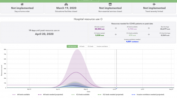
At the time she referenced it and I looked at it for the first time, the model was astounding. It was saying that we would have 5,515 deaths in Alabama, and need more than 32,000 hospital beds on the peak day, when we only have 5,743 available. Also, the ranges were bizarre. Can you really predict that we will need 32,422 hospital beds when your range of uncertainty is 2,262 – 78,614? And can you really say the worst day for deaths will be a count of 341 when your range is 8 – 847 deaths for that day?
 This is a screenshot from those predictions as they were last week. The horizontal lavender line is the number of hospital beds available to COVID patients in Alabama. The dashed lavender bell curve was their estimate of how many beds would be needed, and the shaded lavender are was their range of uncertainty.
This past Saturday, an article was published at al.com referencing this model, with a headline stating Alabama was projected to have the highest death rate in the nation, and contained other dire conclusions from the projections. It did state that these were possibilities and not certainties, but the article was terrifying, and was shared at least half a dozen times in my Facebook feed, alongside much anxiety and fear.
But also by Saturday, the model in question was even more incredible (and by that I mean completely not credible), as they hadn’t replaced their projected data with real data since April 1, which meant that you could see and compare the projections against actual facts now. And they were insanely off-base. A few of those comparisons:
For Saturday, April 4: Actual Hospitalizations in Alabama: 212. Projected hospitalizations in Alabama: between 4,503 – 12,255. Our actual hospitalizations were only 4% of their low range number, and 1.7% of their high range number.
For Saturday, April 4: Projected ventilators needed – 724 – 2,168. We don’t know how many people are actually on ventilators in Alabama, but as we only had 212 hospitalized on Saturday, it was clearly significantly less than their low-range number.
For Saturday, April 4: Actual total deaths (including ones not confirmed by ADPH): 45. Projected deaths: 112. “Only” overstated by 249%.
If the model is off by that gross of an overstatement, it can only be logical to conclude that the peak numbers were also grossly overstated, and therefore should not be used to project what Alabama is going to look like in two weeks when we hit peak virus load.
I was frustrated about an article getting published based on a study that had already proven itself to be extraordinarily overstated, and concerned that it would increase the load of anxiety on already overloaded people. On Sunday I discussed my findings with a couple of friends to make sure I wasn’t looking at the data wrong, and one of those friends, who is a former journalist, encouraged me to email the article’s author with my analysis, which is not something I would normally do. So I did, laying out my reasons for drawing the conclusion that the model couldn’t be trusted.
Within an hour, he replied graciously, thanking me for writing, agreeing that the model had serious issues, and stating that he was looking into writing a follow-up post.
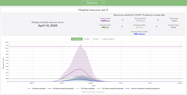
Monday morning, the model and its crazy projections were updated. They replaced the projections with real numbers up through Sunday, and as expected, changing those data points changed the entire skew of the graph, and therefore the entire picture for the state.
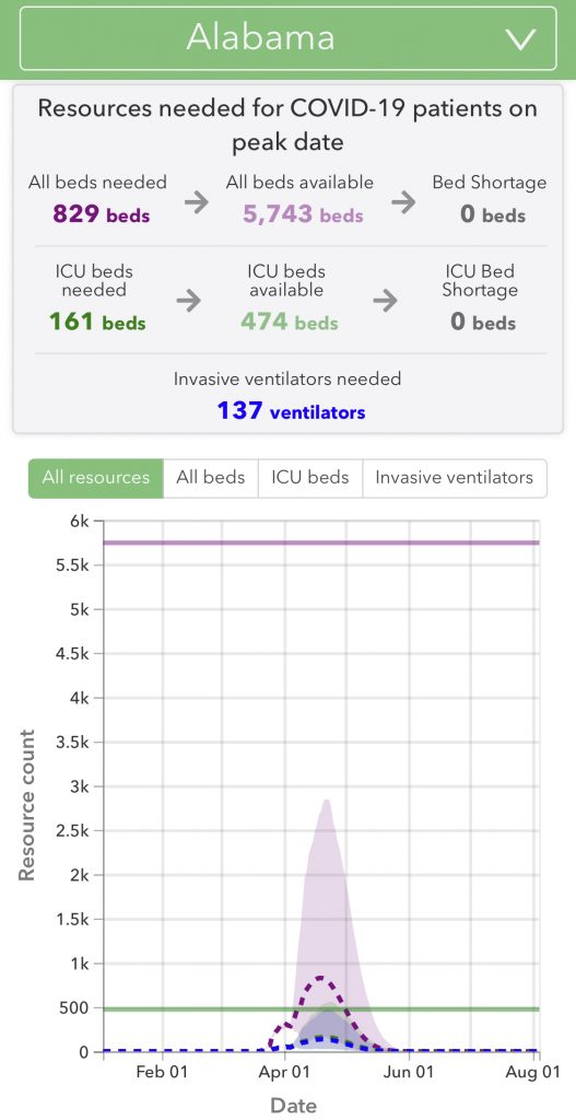
For Alabama, they dropped their hospitalization projections by 93%, (that’s right – they now project only needing 7% of the beds that they projected last week(!!), and therefore projecting that we will get nowhere near our number of maximum beds), they dropped their ventilator projections by 93%, and their death projections by 87%. Instead of 5,515 projected total deaths in Alabama (with a range of 849 – 9,624), they now predict a total number of deaths to be 923 – with a range of 378 – 1,996 – so even their max number is now less than half of their previous projection.
This is a screenshot from the updated model. Notice the number of hospital beds available (horizontal lavender line), which of course did not change, is well above their estimate of how many would be needed.
Part of the reason this changed is because they took into account everything that WE are doing for social distancing. This is good news. Part of it is that projections are just projections. They are not solid truth.
I downloaded the new raw data and compared it to their previous raw data that I grabbed last week, and they drastically dropped their numbers for many states (though there were a few they drastically raised them for), but Alabama was one of their top two most drastic decreases.
As he said he would, the author of the al.com article wrote a follow-up article Monday morning based on the new numbers, and put a disclaimer and link at the top of his prior article (as well as some updates he made to the prior article.) But his new article has not and will not be shared nearly as many times as the original, since it isn’t shocking news.
So I wrote this post to say this:
- Conversations are worthwhile. I was surprised and happy that this journalist took the time to read my email, consider it, and email me back. And even more happy that he wrote a follow-up article repainting the situation of our state.
- If there’s an article with good news, share it! His first post, the dire one, has 40,200 shares. His second, the good news post, has 1,900 shares. Let’s reward our journalists by sharing their good news and not just terrifying news.
- Click through on any data points mentioned by any article. Raw data can be very enlightening.
- Don’t allow projections to control your emotions or outlook. If a projection can drop by 93% in four days, it probably doesn’t mean much.
- But don’t feel bad if you’ve been scared out of your wits by a projection – I certainly had a mini panic attack a few weeks ago after reading the Imperial College of London’s projections – projections that also got questioned and downgraded.
- This is not to say that Coronavirus isn’t serious – it absolutely is. I am completely on board with all of the social distancing we are doing – my car’s tank of gas is currently 20 days old and counting. However, I believe that allowing panic, anxiety, and horror to consume us is also not healthy. We can do everything we need to do to minimize this virus’ impact AND have some peace of mind. We don’t know what this virus will do. No one does, really. But we can do our part, so many of us are doing our part, and it is helping tremendously.
- Be encouraged – there are new tests, new discoveries, and medications being frantically tested and found to help.
- And again, share encouraging news. Overwhelm the scary news. We all need encouragement and light right now. Let’s share it.
My favorite data analysis tools:
For raw data:
Alabama:
Good news – what we’re doing is working:
- Based on aggregated, anonymized smart thermometer readings, we can see a significant decrease in fevers around the nation.
- Based on aggregated, anonymized cell phone location data, we can see people’s nonessential travel decrease. (Ignore the grades they give each state – I find that too subjective. But I like the graphs when you click on each state and county.)
April 10 Update: Since I wrote this, there have been three more updates to the model referenced, and all of them have consistently decreased the projections of hospitalizations and deaths in Alabama. What was a projection on April 1 of 32,422 beds needed at peak has now decreased to 829. That is merely 2.5% of the former projection. The total death count for Alabama was projected at 5,515 last week, but today the projection is down to 431, a 92% decrease. Although I still don’t put stock in the projections themselves, their dramatic and consistent decreases are good news. This virus is absolutely a catastrophe for those affected by it, but the number of people affected has been drastically diminished. Social distancing is working. And the worst case scenario is not going to occur in Alabama.


Love this so much! People are too quick to share something scary or be fooled by a pretty graph. :) I love the thought of “just consider all of the facts”.
Well done, as usual! I love how you analyze data and present a common sense conclusion.
Thank you for this! Have you considered looking at more data and doing this again? I know NYC and CA has been hit the hardest, but it seems the media is using their numbers for the rest of the country, which seems unreliable. I’m in Arizona and in no way do we have the dense population like NYC, so I wonder if anyone is running numbers on the “fly-over states”.
I have all the numbers from the projections saved, and Arizona’s projections have also dropped (though not as dramatically as Alabama.) Your hospital numbers have gone down about 60%, and your total deaths have gone down about 20%. If you want more detailed numbers, let me know!
Wow! I keep hearing that our hospitals are empty, so this makes a lot of sense! Now the big question – when do we stop the “shelter in place” order? I wonder what the “experts” want to see for that to happen? (Not that you have to answer, of course, but I’d love to see some light at the end of this crushing tunnel…). Anyway! Happy Easter to the Callahans!
Interesting example of unintended consequences. If you look at the MD travel data on https://www.unacast.com/covid19/social-distancing-scoreboard there’s a spike in mobility on March 30 – the day the governor made shelter in place mandatory instead of strongly recommend.
Thank you so much for applying your knowledge to help give us hope and ease anxiety during these difficult times. We all need to keep thinking and continue good social distancing practices. It would help if Walmart would not make toilet paper an “in store purchase only” item! I am not going into the stores.
We’ve been following that same projection! According to it the peak for WA has already passed. IF we keep social distancing. Very encouraging though!
Hi Rachel. I’m a 45 year old version of you except that I’m an engineer data nerd vs accountant data nerd :). You’re also a better writer than I am. I did the same as you. Someone shared that ridiculous WaPo graph last week and I started digging. AL.com reported on the earlier model before the 4/1 update. I focused on the mean peak fatality/day number from the article and the model. As it turns out, the modelers are essentially using the daily fatalities as their primary input for the model, and then back-calculating the # beds, ventilators, etc. Anyway, the IHME model was predicting 37 fatalities/day (mean) at peak and 57 max before the 4/1 adjustment. When the model was adjusted on 4/1, 37 shot up to 202 fatalities per day at peak. There is a good article from Chip Brownlee from alreporter.com where he interviews one of the IHME modelers and I had a good conversation on twitter with him (Chip) last night. I expressed disappointment that he and other reporters didn’t question the 4/1 model for AL and how ridiculous it looked. In the end, through discussion with Chip, What broke the model was the change ADPH made to their fatality reporting. On 3/30, there were 6 total fatalities in AL. On 3/31, ADPH started reporting 2 different numbers, 13 ‘died with illness’ and 24 ‘reported deaths’. The modelers used the higher number (and they are still using the higher number). But the daily increase from 6 to 24 is what resulted in the ridiculous model that ABC3340, alreporter.com, AL.com, and WaPo (at a minimum) used to scare people in AL. Here is the al.com article from 3/31 reporting the prior model (now 2 version ago) that showed 57 max fatalities per day at peak. https://www.al.com/news/2020/03/alabama-could-see-1700-coronavirus-deaths-by-august-study-estimates.html And here is the website with AL historical numbers. It includes screenshots and what time they were taken. https://covidtracking.com/data/state/alabama#historical The model is still garbage – at peak we will have 4 to 200 fatalities per day – that’s not a model, it’s a rough guess. All of this is a classic example of Garbage In, Garbage Out.
Thanks for your fascinating info! That is a good way to understand what happened with the model. I’m glad there are more and more people every day asking questions and seeking understanding.
We’ve had the same issues in Iowa. The data that was being used to project cases and deaths was from a company that hadn’t taken into account that schools had been closed for weeks and wouldn’t be reopening. That is a HUGE error and created numbers many times greater than actual real time cases.
I am in PA and have not really followed the projections but I do know we are being hit hard, 16,000 today but I keep going over our death rate percentage. I like to look at those numbers. It’s no where near the percent that they first reported for the US with the 100,000- 240,000 deaths. I don’t understand where they got it from even if this lasts well into the summer. They are even thinking we are headed to be like NJ soon and I don’t see that either. We are social distancing, wearing masks and our kids are not playing with the entire neighborhood. Apparently my neighborhood thinks kids are the exception…. It’s sometimes like summertime, everyone out and playing together.